Brian Noyes
Photographs by Jeff Crites and Brian Noyes
Article first appeared in UCDA’s Designer magazine (Vol. 35, Issue 1, Spring 2010)
Brian Noyes, former art director for Smithsonian, House & Garden, The Washington Post Magazine, and Preservation, left 30 years of magazine art direction to follow his passion for baking.
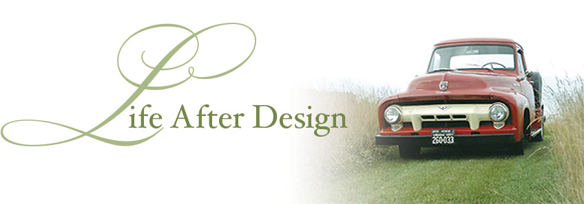
After education at the Culinary Institute of America (the other CIA) in Hyde Park, New York, and the respected L’Academie de Cuisine in Maryland, he launched the Red Truck Bakery out of his farmhouse in the upscale hunt country village of Orlean, 50 miles from Washington, DC. The bakery, named after the 1954 red Ford pickup he bought from designer Tommy Hilfiger, soon proved to be a hit; customers were awaiting his arrival each Saturday morning at area stores and the goods sold out quickly. A story in The New York Times food section about the Red Truck Bakery sent 57,647 people to his website in one day (only 26 hits the day before) and the orders poured in during the holidays. After looking at dozens of potential locations in the Virginia Piedmont for his own site, he signed a lease at the end of March 2009 on a 1921 Esso filling station in the heart of Old Town Warrenton, next door to the courthouse (old red truck + old filling station = all kinds of marketing possibilities). He recently completed renovations and is enjoying the life of a successful baker and community leader.
Part of his meticulous renovations included the interior design of the bakery space. “We had an old beat-down filling station, in the heart of Old Town Warrenton, that needed some loving care. It’s the first thing one sees when entering the Main Street area and I always knew the place had potential. The front office area became the retail space, and we remade the two large service bays into a communal dining room and the bakery’s kitchen. The roll-up service doors remain.” With the help of architect Dwight McNeill, interior furnishings and fittings were selected, creating a clean, uncluttered space with a minimalist, genuine feel. A combination of salvaged materials and sustainable furnishings complete the space. Aluminum industrial lighting, reminiscent of the former service station’s glory days, was found at Ikea for $29 each. A table for customers who prefer to devour their baked goods on site was created from boards from a local barn that had burned down during General Philip Sheridan’s Civil War march through Virginia; the table is teamed up with truck-red scoop-back modern chairs from West Elm.
As any designer would do, his selection of what others might consider small details, like the typography, were meticulously planned. The namesake of the bakery, the 1954 pickup, and the location, the 1920s filling station, cried out for a graphics program that was anything but “now.” Typefaces harking back to the 1930s and 40s were used; they’re actually new cuts created by a type designer who remakes period typography for Hollywood movies. “I fell in love with the typefaces when I saw the ampersand—it’s gorgeous!” says Noyes.
The details of packaging also play to Noyes’ strengths. Telling a story of a recipe, or the recipe’s creator, on packaging are part of the Red Truck Bakery brand. His rum cakes, for example, are from the recipe of a 90-year-old local choir director who gave it Noyes before she passed away. “She wouldn’t drive herself to the liquor store for the rum,” he says. He hasn’t changed the recipe, and her photo graces the cake’s package.
Creating, maintaining, and directing the brand of his own rural bakery is part of Noyes’ satisfaction with his career path. “Instead of using my passion for someone else, I’m building my own brand for myself,” he says.
His advice for fellow creatives: “Do what you want to do.”